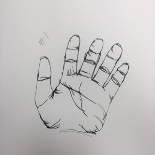
Blind Contour
These are my two blind contour drawings of my hand. I think I did a good job, but I need to work on knowing where my pen was on the paper. I also need to work on moving my eye and hand at the same speed while I observe and draw objects and figures.

Modified Contour
This is the best modified contour drawing of a hand that I did. I think the detail looks nice, but I should sketch less and the fingers should be longer.
Backpack Contour Drawing
I really liked my backpack ;line drawing even though I sketched on it I still think it looks cool I was the hardest to not pick up the pen on this one.


Contour Room Drawing
 1. Did you use a fluid line? Explain how is this evident?
While drawing the room I did not draw with a fluid line. I used a lot of sketching to try and add detail as you can see in the person that I drew.
2. Explain how your knowledge and creating practice studies with contour line contributed to the success of your piece.
 Having practiced before hand helped me to get better at tracing things with my eyes and drawing it. It also helped me to get the proportions more correct.
3. Describe the difference in your contour line drawing to an outline drawing.
An outline drawing doesn't have the detail of a contour line drawing.
4. Explain how your interpretation of line is essential in capturing the look of the room.
The look of a line drawing helps to add depth and texture to the piece. Using lines in different ways can help to add to the piece like using curved lines to outlines and reflections.
The look of a line drawing helps to add depth and texture to the piece. Using lines in different ways can help to add to the piece like using curved lines to outlines and reflections.
6. What did you learn from completing this drawing? If you could recreate your piece what would you do differently to enhance the final outcome?
I learned proportions and how to create textures. If I could do one thing over again I would not sketch to add detail.
I learned proportions and how to create textures. If I could do one thing over again I would not sketch to add detail.
Ribbon Drawing
 Drawing the ribbon I used white colored pencils and did reverse shading.

Value Drawing


I did the value scale in pencil then I used the values to create shapes.
Fabric Drawing

This is my practice fabric drawing I used a mix of charcoal pencil and vine charcoal to do these drawings.
Final Fabric Drawing

1. Did you use a wide range of values? (A range from white to black with at least 9 values). Explain how is this evident?
Yes, you can see the clear difference of the dark values and the white of the highlights, and it has medium values.
2. Explain how your knowledge
and creating practice studies with value contributed to your piece
Using the techniques that I practiced on the fabric drawings contributed to my piece because I was able to draw the shadows in the fabric and add the highlights.
Using the techniques that I practiced on the fabric drawings contributed to my piece because I was able to draw the shadows in the fabric and add the highlights.
3. Describe the blending and
transitions in your fabric (discuss your use of pressure with pencil/colored
pencil/charcoal pencil and other techniques to achieve this).
To add all the values I pushed harder on the the pencil to add the dark shadows and and slowly added less pressure to get the medium values. I then went back and add the highlights with a white charcoal pencil.
4. Explain how your
interpretation of texture is essential in capturing the look of the object.
To get the texture of the fabric correct you need to have it smooth. I don't think I did the best that I could; in the future I would smooth it out more.
6. If you could recreate your
pieces what would you do differently to enhance the final outcome?
In the final fabric drawing I used charcoal pencil and
white charcoal to do the highlights. I would change it by smoothing out the lines and making it blend better.
Still Life Drawing

It doesn't have clean edges it is very messy and I would like to redo it soon.
2.
Are
your values and shadows realistic? How many values did you include? How and why
are values important?
I think I need to add more highlights to the piece it is to dark and it makes it look bad.
3.
Is
there a clear source of lighting?
There is not a clear source of light in my piece because it lacks highlights
and it is mainly all medium values.

and it is mainly all medium values.

4.
How
important were the compositional sketches? Explain.
The sketches were important because they helped me choose the part of the still life to draw.
5.
How is
your final drawing successful?
It didn't turn out how I wanted it but I was able to draw everything in the picture.
6.
Are
the proportions, structure and perspective of the subject correct?
Yes, all the proportions, structure and perspective were correct but the values were wrong.
7.
Does
the placement & grouping of objects create a pleasing arrangement
(composition)?
No, it looks busy and I think I should have more negative space in the picture.

8.
Is
there a center of interest and is it well located?
The center of the picture is the coke bottle. I think it is well located because it isn't in the center and it has nice highlights.
9.
How
well did you manage your time and resources throughout the process of creating
this drawing? Do you see where you could
improve in this area?
I could have managed my time better because I wasn't able to finish it in time and had to cut out a portion of it.
10. What challenges did you encounter during
this project and how did you overcome them?
The shading was very difficult to do and I wasn't able to fix it because I ran out of time. If I was able to fix it now I would try and add highlights to it.
11.
What
have you learned drawing a still life?
I think I would have rather used a different medium because charcoal smudged everywhere and I'm not sure how to fix it.


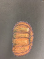 I think colored pencil is my favorite drawing medium I think I did a good job with the highlight and shadow on the spheres and the pumpkin and apple in the spheres picture.
 1. Describe
how you created an interesting point of view? Was it successful? Why or why
not?
1. Describe
how you created an interesting point of view? Was it successful? Why or why
not?


1. Explain how value is important in this drawing.
 It was hard to draw with chalk because it kept on disappearing and blending away I overcame it be doing light layers and
 4.
Explain how
your interpretation of texture is essential in capturing the look of the object. The candy and wrapper are both very different textures so getting both was difficult. The candy has a smooth matte texture which was easy to get with the chalk. It was harder to get the look of the wrapper because it is see through and reflective so adding highlights was very important.
4.
Explain how
your interpretation of texture is essential in capturing the look of the object. The candy and wrapper are both very different textures so getting both was difficult. The candy has a smooth matte texture which was easy to get with the chalk. It was harder to get the look of the wrapper because it is see through and reflective so adding highlights was very important.


Opacity Drawing
 Describe how your background choices
help unify the three artworks and tie them together as one piece of art.
Describe how your background choices
help unify the three artworks and tie them together as one piece of art.
I'm confused by this but I used a foreground middle-ground and background to create the illusion of a process of making cake pops and a bakers work space.
 Describe your choice of colors/color harmonies and how you used
them throughout the artwork.
Describe your choice of colors/color harmonies and how you used
them throughout the artwork.
I used pastel colors through out the piece to make the piece softer and for a younger viewer because it's candy and sugar which reminds me of being little.
I think I would have rather used a different medium because charcoal smudged everywhere and I'm not sure how to fix it.
Colored Pencil/View Drawing


 1. Describe
how you created an interesting point of view? Was it successful? Why or why
not?
1. Describe
how you created an interesting point of view? Was it successful? Why or why
not?
I used the lines in the wood to draw the view to the water and the owl.
2. Why is it
important to understand perspective and how to draw it?
With out perspective the view would look weird and everything would be on the same level.
3. How were the
colored pencil exercises important in the success of your piece?
The colored pencil drawings helped me prepare for the picture because I was able to learn how to add shadows and highlights.
4. Describe the
craftsmanship of your colored pencil. What techniques were used? (How well the
project is technically crafted).
I used a lot of different colors to add to the piece and make it look more realistic.

5. Were you able to
achieve depth by showing a foreground, middle ground and back- ground? Explain.
Yes, you can clearly see what is close to you and what is far away. The boards get smaller as the dock gets farther away and the islands in the back are smaller than the deck.
6. Explain your
experience with colored pencil and the project in general. What were the
obstacles and advantages?
I love working with colored pencils I think one struggle was that I couldn't use black for shadow which is weird because most of the time when drawing dark colors I would add black but I didn't add it at all and only used dark green, dark blue and dark brown. With colored pencils I was able to fill the whole page and add lots of details.
7. Looking back on
the progression of this project what skills, techniques or other information
would you like to have been taught? Do you feel you were prepared for this
project?
I feel that I was well prepared for this project the still life helped me to know where to place stuff and the perspective practice drawings helped me to get the correct perspective in the piece. While working on the colored pencil sketches I learned that to draw my best I can't draw what I think is there but what is really there because drawing what you think causes you to mess up, like on my second pumpkin drawing on the black paper.Progression Drawing

1. Explain how value is important in this drawing.
Value is important to this project because it shows the shape of the candies and the cylindrical shape of it, it also shows how the wrapper folds in and out on the ends.
2. Describe several challenges that you faced while creating this
drawing. What did you do to overcome
these obstacles?
 It was hard to draw with chalk because it kept on disappearing and blending away I overcame it be doing light layers and
not blending hard so that the color would stay on the paper.
3. How important was it to have clean crisp edges to your wrapper?
It's very important because it shows that it folds in and out and is fluid not straight. Without the crisp edges then it wouldn't look right.
 4.
Explain how
your interpretation of texture is essential in capturing the look of the object. The candy and wrapper are both very different textures so getting both was difficult. The candy has a smooth matte texture which was easy to get with the chalk. It was harder to get the look of the wrapper because it is see through and reflective so adding highlights was very important.
4.
Explain how
your interpretation of texture is essential in capturing the look of the object. The candy and wrapper are both very different textures so getting both was difficult. The candy has a smooth matte texture which was easy to get with the chalk. It was harder to get the look of the wrapper because it is see through and reflective so adding highlights was very important.
5.
Name three
things you would draw differently if you were to do this project again. What did you learn from this drawing?
If I did it over I would try to make the candy less see through because you can see the paper through the drawing, other than that I think the piece turned out well. I learned how to use chalk with light layers and not a lot of blending.
Dum Dum Drawing
I used prisma colors and added blues as the shadows and the creases in the wrapper. If I did it over I would make it bigger.
Chalk Practice Drawing
This was the chalk practice I learned about blending and different ways to textures.
Opacity Drawing


Describe the craftsmanship of your drawing. (Is it neat and well executed?)
It's unfinished but I think I did a good job of highlighting the wrapper and adding the value to the spheres to show that they are round. I also like the highlight on the glass around the cake. I'm glad that I added a little more detail on the cake pops with the sprinkles. Overall I like the piece and the concept of having the stages of making cake pops.
It's unfinished but I think I did a good job of highlighting the wrapper and adding the value to the spheres to show that they are round. I also like the highlight on the glass around the cake. I'm glad that I added a little more detail on the cake pops with the sprinkles. Overall I like the piece and the concept of having the stages of making cake pops.
 Describe how your background choices
help unify the three artworks and tie them together as one piece of art.
Describe how your background choices
help unify the three artworks and tie them together as one piece of art.I'm confused by this but I used a foreground middle-ground and background to create the illusion of a process of making cake pops and a bakers work space.
 Describe your choice of colors/color harmonies and how you used
them throughout the artwork.
Describe your choice of colors/color harmonies and how you used
them throughout the artwork.I used pastel colors through out the piece to make the piece softer and for a younger viewer because it's candy and sugar which reminds me of being little.
How
did you create contrast in your drawing?
The table was a darker color and the boxes for the cake pops were a brighter color. The difference of pastel and dark colors makes the pastel parts stand out more.
The table was a darker color and the boxes for the cake pops were a brighter color. The difference of pastel and dark colors makes the pastel parts stand out more.
How
did you use textures, highlights and
shadows to enhance your artwork?
I made sure the cake pops and the whole piece smooth I wanted to try to make the pops look more matte the shadows helped to make it more realistic and the highlights add to the wrapper and make it look realistic.
I made sure the cake pops and the whole piece smooth I wanted to try to make the pops look more matte the shadows helped to make it more realistic and the highlights add to the wrapper and make it look realistic.
Why
did you choose a particular background
color to mount your artwork?
I used gray because I knew I wanted to used blues and purples in the drawing and gray goes well with those colors if it were to shine through.
I used gray because I knew I wanted to used blues and purples in the drawing and gray goes well with those colors if it were to shine through.
Discuss
the importance of understanding the media (prisma or pastels) and acquiring the
skills necessary to create a successful project.
I used prisma and to use that you need to work on layering and and blending slowly in my opinion it is easier to use than pastels because they brush away easily.
I used prisma and to use that you need to work on layering and and blending slowly in my opinion it is easier to use than pastels because they brush away easily.
Describe any difficulties you had
creating your drawing and what you could do to improve your drawing?
I was hard to put all the details of the wrapper and the sprinkles on the cake pop before making it to waxy to color on top of. If I had to do it again I think I would work harder on focusing on putting the details in at the right time.

 Discuss
your drawing. Use your own words to
describe, analyze, interpret and judge your artwork. Add art vocabulary to make your critique
better. There are a few
questions to guide you so you need to be as in depth as possible.
Discuss
your drawing. Use your own words to
describe, analyze, interpret and judge your artwork. Add art vocabulary to make your critique
better. There are a few
questions to guide you so you need to be as in depth as possible.
For this project I did the expression of having my tongue sticking out I used prisma colors and put a focus on the open eye and the mouth so that peoples eyes were drawn there. I made sure to add different colors such as purple and I made sure to blend all the colors together well with a blending pencil. First I started off by sketching out the outline of my face and features. I then worked on the focus of the picture, the eye and the mouth. After that I went in and added the shadows and highlight and the skin tone next and added lots of layers over and over again. I then add the hair and the other parts of the piece not on the face.
 Discuss
how you accomplished depth and value in your drawing. Why did you choose the
portrait style that you did? What is the most important aesthetic quality of
your drawing? How were you able to give the viewer and interesting experience
with your choice of medium and techniques? If you are unsure what aesthetic
means then look up the meaning and write it with your critique.
Discuss
how you accomplished depth and value in your drawing. Why did you choose the
portrait style that you did? What is the most important aesthetic quality of
your drawing? How were you able to give the viewer and interesting experience
with your choice of medium and techniques? If you are unsure what aesthetic
means then look up the meaning and write it with your critique.
 I used a wide range of values from pure black to white I used a mix of blue purple and brown for the shadows on the skin. I chose to do an expressive portrait because I wanted to keep it and have it look like me and not be too crazy. The use of prisma colors added a realistic quality to the picture and helped to make it more interesting and vibrant like the face I'm making. I think the most aesthetic part of my piece is the eye I put a lot of detail and different colors in it to make it interesting and realistic.
 Does
your drawing evoke feeling and expression? How did you accomplish this?
Does
your drawing evoke feeling and expression? How did you accomplish this?
I think it does I think that the face I'm making is a mix of serious and funny and the viewer would get to choose how they felt about it. I think the eye is more serious and the mouth and tongue are the funny less serious quality and each viewer could have a different opinion of it.


I was hard to put all the details of the wrapper and the sprinkles on the cake pop before making it to waxy to color on top of. If I had to do it again I think I would work harder on focusing on putting the details in at the right time.
Self Portrait Drawing
 Discuss
your drawing. Use your own words to
describe, analyze, interpret and judge your artwork. Add art vocabulary to make your critique
better. There are a few
questions to guide you so you need to be as in depth as possible.
Discuss
your drawing. Use your own words to
describe, analyze, interpret and judge your artwork. Add art vocabulary to make your critique
better. There are a few
questions to guide you so you need to be as in depth as possible. For this project I did the expression of having my tongue sticking out I used prisma colors and put a focus on the open eye and the mouth so that peoples eyes were drawn there. I made sure to add different colors such as purple and I made sure to blend all the colors together well with a blending pencil. First I started off by sketching out the outline of my face and features. I then worked on the focus of the picture, the eye and the mouth. After that I went in and added the shadows and highlight and the skin tone next and added lots of layers over and over again. I then add the hair and the other parts of the piece not on the face.
 Discuss
how you accomplished depth and value in your drawing. Why did you choose the
portrait style that you did? What is the most important aesthetic quality of
your drawing? How were you able to give the viewer and interesting experience
with your choice of medium and techniques? If you are unsure what aesthetic
means then look up the meaning and write it with your critique.
Discuss
how you accomplished depth and value in your drawing. Why did you choose the
portrait style that you did? What is the most important aesthetic quality of
your drawing? How were you able to give the viewer and interesting experience
with your choice of medium and techniques? If you are unsure what aesthetic
means then look up the meaning and write it with your critique.  I used a wide range of values from pure black to white I used a mix of blue purple and brown for the shadows on the skin. I chose to do an expressive portrait because I wanted to keep it and have it look like me and not be too crazy. The use of prisma colors added a realistic quality to the picture and helped to make it more interesting and vibrant like the face I'm making. I think the most aesthetic part of my piece is the eye I put a lot of detail and different colors in it to make it interesting and realistic. Does
your drawing evoke feeling and expression? How did you accomplish this?
I used a wide range of values from pure black to white I used a mix of blue purple and brown for the shadows on the skin. I chose to do an expressive portrait because I wanted to keep it and have it look like me and not be too crazy. The use of prisma colors added a realistic quality to the picture and helped to make it more interesting and vibrant like the face I'm making. I think the most aesthetic part of my piece is the eye I put a lot of detail and different colors in it to make it interesting and realistic. Does
your drawing evoke feeling and expression? How did you accomplish this? I think it does I think that the face I'm making is a mix of serious and funny and the viewer would get to choose how they felt about it. I think the eye is more serious and the mouth and tongue are the funny less serious quality and each viewer could have a different opinion of it.
Candy Drawing

Realistic candy
Skull Drawing

Scratchboard Drawing

Describe the
subject matter and meaning of your artwork.
The subject matter is the clothes line. The meaning is the movement of the fabric in the wind.
The subject matter is the clothes line. The meaning is the movement of the fabric in the wind.
How did you use
textures to enhance your picture?
I used the textures of the grass and the fabric to add movement and make it look realistic.
I used the textures of the grass and the fabric to add movement and make it look realistic.
How did you balance your artwork and create a
well-organized composition?
I added a black area so that it wasn't to busy of a picture.
I added a black area so that it wasn't to busy of a picture.
How did you imply movement in your drawing?
I added movement with the shadows on the fabric and the grass in the front.
How could you
improve your artwork?
If I needed to improve on anything I think it would be managing my time and working on the fabric and grass. I think I should added more highlights to the grass and make the fabric more realistic.
How did you
demonstrate a wide range of shading
values?
I took away a lot for the highlight and cross hatched in different ways to show the change of value. The more highlighted areas had close cross hatching and less had farther apart cross hatching.
No comments:
Post a Comment